Wednesday, September 28, 2011

Getting Started with HL7v3


Someone asked me how to get started learning HL7v3 and I thought, hmmm...

I went looking for a simple definition, and the best I could find was from PC Magazine:
(Health Level 7) ANSI-accredited standards for electronically defining clinical and administrative data in the healthcare industry from Health Level Seven International (www.hl7.org). HL7 provides standards for messaging, electronic records, decision support queries, medicine labels and the visual integration of data from different applications.

The "7" in the name comes from application layer 7 in the OSI model, which is the highest level where programs talk to each other. HL7 does not deal with the lower levels of the OSI model, which are the transport and network protocols.
Okay, so where to start.


RIM
Reference Information Model. You can represent anything with this, all the basic building blocks organized by structure but not use case. It is typically implemented in XML, and can therefore be represented by an XML schema, or by a set of interfaces in an OO programming language.

The RIM can be thought of as the data and workflow model. The HL7 Standards Blog did a good brief description of this, and I would recommend reading their blog post, HL7 V3 RIM: Is it Really That Intimidating?

The RIM consists of actors, actions, relationships, roles, and entities. Everything happening in the course of care is an Act, and each Act may have any number of Participations, Roles, and Relationships between Entities. For another overview, see the HL7 Australia page on HL7 V3 Resources. Obviously this is as generalizable as possible, so to do useful things it is necessary to constrain the model in different ways, which leads us to the Clinical Document Architecture (CDA).

CDA
The standard for representing clinical documents using the all-purpose RIM. The Clinical Document Architecture ... the actual data structures we use in representing health information. Where the RIM represents structures, CDA organizes those structures into use cases. CDA R1 is finalized. R2 is not done yet. At least, the standard isn't finalized and is subject to change.

There are many standards documents within the CDA model, but they can be divided in two categories. There are the building blocks which define document components, and there are the documents themselves, which aggregate the components into complete clinical documents.

Two commonly used building blocks are C83 sections, and C80 code sets. Most clinical documents can be thought of as collections of C83 sections, with data encoded as prescribed by the corresponding C80 specification.


At the 2009 Connect Seminar, a simple diagram of the CDA standard relationships was given as part of a presentation. The full presentation may be downloaded from www.connectopensource.org (PowerPoint):

You can see the different types of documents
  • C28 - Emergency Care Summary
  • C32 - Summary Documents using HL7 Continuity of Care Document (CCD)
  • C38 - Patient Level Quality Data Document
  • C48 - Encounter Document
  • C78 - Immunization Document
  • C84 - Consult and History & Physical Note
These documents are all defined in terms of which C83 components they contain.

There are many more types of documents, covering a wide range of use cases. A full list of the CDA document standards can be found on the HITSP Site. You can also see my earlier blog post about how CCDs are built.

Really, that's all you need to get started. Learn the RIM, choose the HITSP CDA documents applicable to your use case, and study the C83 sections and C80 codes needed. Then you're ready to get to work. Happy coding!
Friday, July 22, 2011

Java 7 Launch Event

Java 7 is scheduled to be GA this summer. A video of the official announcement can be found here:

http://www.oracle.com/us/corporate/events/java7/index.html

A summary of Java 7 features (my rough notes from the talk):

JSR 292 - invokedynamic - the davinci machine
more languages on jvm, new bytecode, dynamic languages

Project Coin JSR 334
small changes, syntactic sugar, String in switch, constructor generic inference, multi-catch, try with resources to properly close all resources

Concurrency and collections updates JSR 166y
lightweight fork/join framework

network and file system JSR 203
zip and jar archives

enhanced JMX agent and mbeans from jrockit


security: elliptic curve cryptography, TLS 1.2, DEP

unicode 6.0

Windows Server 2008 support

JDK7 to be released July 28

JDK8 to include jigsaw, closures late 2012 - possible JSON serialization

Monday, June 27, 2011

Yet Another Google Health Memorial Blog

Me Too! Me Too!

I wanted to wait at least a few days to let everyone else pile on Google Health before I threw in my two cents from the peanut gallery. Of course there has been plenty of I told you so, should have listened, and here's where we went wrong, all rightfully so. If you want to hear that, buy me a drink sometime. Right now I don't want to repeat what's already been said, except for what deserves to be repeated: I will trust my doctor and primary care facility to store my medical records, and no one else. That is the only way it will work.

Now, let me add this: Google Health was too generic.

Specialization is Your Friend

The comparison has been made between "tethered" and "untethered" PHRs. It would seem logical that providers want to keep patients - more treatment means more revenue - and that makes people tend to build patient portals which drive patients into their own institutions (and profit centers) and not to their competitors. I don't look at it this way. I think each provider facility is so specialized that they look at a general-purpose PHR and think, "This isn't exactly what my patients need." If it's not exactly what the patient needs, it's useless, possibly harmful. Even among the few large makers of traditional EHR systems, every single installation is different and highly customized. Why wouldn't patient systems be just as specialized?

Every hospital has its specialties, its centers of excellence, and a patient population more or less centered around what it does well. Let's say, for example, a referral hospital specializes in transplants. They are in the best position to design a PHR-type system with the features that transplant patients need, and transplant patients will flock there for treatment with or without a PHR.

Say another hospital treats a lot of cystic fibrosis patients. They, too, have an idea of a different set of features that will serve their patient population best, and if they are very good, it is entirely possible that nearly every cystic fibrosis patient in the country will have an account on their patient portal. One only needs to look at primary care facilities such as Kaiser, the VA, and Palo Alto Medical Foundation to see the first hints of how this can work.

If you start out by defining your patient population as "everyone," how are you going to even think about what features are needed most? Most common denominator? Most efficacious numerator? It's a recipe for stasis and mediocrity.

Precisely what problem were they trying to solve? It's easier from an engineering standpoint to define the problem in terms of data. After all, Google's stock and trade as a company is moving and analyzing data in large amounts, so naturally they tackled the health record head-on by building a nearly exact replica of a standard patient summary document and not much else.

What we have here is not a health record problem, it's a health visualization problem.

Physician, Heal Thy Computer

It's going to be up to the clinicians to figure out what patients need, and can use, from web technology. If you are a physician and have a great idea, you will have no trouble finding talented engineers to build it for you. Even if you have a lousy idea - like Google Health proved to be - you can see there's no shortage of talent, dedication, and know-how to make it happen.

What we need is something that lets clinicians with good ideas implement them, on their own EHR systems, in small pieces. Up to this point, if you wanted something as simple as a glucose monitoring chart for your diabetes patients, it took a lot of work just to build infrastructure around getting the data from its various sources and loading it into a web application. What if you could devote 90% of development time to data visualization, instead of data plumbing? Then we can let a thousand flowers bloom.

What if, eventually, patient records could aggregate from diverse sources into your system, making your patient portal a place to store, view, and analyze a personal health record for as long as you have patient consent to keep it within your facility? What if the PHR was an entity of pure data, and followed the patient from system to system? As long as you have a primary care facility, would you even need a Google Health?

Engineering is a marvelous and noble profession, but clinicians are coming from the more important - and complicated - side of the equation. I've been programming since I was 12 years old and the most difficult, complicated, incomprehensible system I've ever come across is health care, only to hear a respected, practicing physician look at computer diagrams and say, "I don't know that technical stuff." Yes you do. Healthcare is all technical stuff. Anyone who can understand medicine enough to practice it, can go on to say, "I know what these particular patients need from a medical record." That's who will be driving the technology forward.

Google Health is dead. The PHR is just getting started.

Friday, June 24, 2011

Hey @fitbit ur doin it rong

That new fitbit device looks pretty nifty. It even has "social." You can connect with your friends, and it keeps a leader board for you all to watch. The past week, the past month, that's the game. I don't see a lot of action there. I'd rather have some good casual games, small enough to fit in a game with friends one afternoon.

For example, take the famous 24 Hours of LeMans race, where drivers race on a track for exactly 24 hours, at which point whoever completed the most laps wins. You can do the same thing with a pedometer, and you can use any time period: a day, an afternoon, a week - as long as somebody gets to say, "Ready, set... Go!" When the time is up, whoever has been most active wins. After all, being active is what fitbit measures.

Can everyone play? Even couch potatoes?

Yes, if you do a good job handicapping the races, like you would in the game of golf. For example, I walk a lot -- 45 minutes to and from work every day, plus to the store and everywhere else. I drive maybe once a week. My friend leads a rather more sedentary lifestyle, to put it mildly. How can we compete against each other? The game could analyze our past fitbit records and use that level to assign a handicap for each player. I don't play golf but I think that's how it works.

This will make real competitions possible, regardless of lifestyle or current fitness level. How would you feel knowing you could beat your marathon-running buddy in a fitbit race?

That's it, casual competition with friends, each of us playing to our own level of health. If fitbit can do that, I'll buy one just because my friends are doing it.

Tuesday, April 19, 2011

Google Data.gov - How Hard is That?

Never before in human history has democracy had the tools available, where ordinary voters can so easily examine the workings of government in such detail. We are seeing the first few steps in a larger change in the fundamental way this information is managed.

Google Public Data Explorer launched February, 2011.

Tax day has come and gone and my dear old Uncle Sam and I have settled our accounts for another year. Everyone has an Uncle Sam, a nice old guy who doesn't manage his money so well so I help him out once in a while, just to, you know, make ends meet. You can't say no to Uncle Sam, with his white beard and stove pipe hat.

I don't know politics but I do know the Internet, which is full of crazy political rants. If you want to lose faith in humanity, just go to the Internet, find people who identify with a political party, and read what they writes about the other. Good times.

But hey, real issues, real money. What do I know?

What do I know just changed dramatically. Imagine if every dollar spent in the government, every receipt, every outlay, were recorded and place at my fingertips. What if I could chart all the government expenditures and revenues using any level of detail or axis of measure I choose?

You can get a taste of this with Google Public Data Viewer. It lets you mouse over the data, select, and change the perspective or data sets as fast as you want. The tools are here and only getting better. The only barrier now is getting everything concerning public policy into these data sets. In some ways, the process has been managed with all the bureaucratic efficiency one would expect, but what has been done is now rightfully mine to peruse and inform my vote. It's the citizens' data really, the taxpayers paid for it, and we own it. Let's take a look.

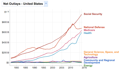
I decided to start with the phrase often heard lately: "We don't have a revenue problem, we have a spending problem." I bet if I can chart the various government expenditures, I'd agree with that. You can find the Federal Finances Dataset in the Google public data explorer Dataset Directory. I started with something simple: net outlays by year.


Yikes! It sure does look like we have a spending problem!. I also noticed how social security follows a relatively smooth upward curve, while the others have more little ups and downs. Everything's going up, except the few things everybody talks about cutting: science, education, agriculture, and energy - those programs behave the way I like my own budget, with a set price that doesn't go up every year.

Now what happens to those numbers if we compared them to the size of our economy? After all, we have more people, bigger cities, more jets, more of everything. So in terms of taking a percentage of our collective wages, what does our government look like?

Everything changes. Social Security isn't up nearly as much as I thought, the smaller programs are actually down, and the only thing that's really going up is health care. Maybe it is urgent, after all, maybe we should look at reform, as opposed to the plan I like to call repeal-and-replace-maybe-later-if-we-get-around-to-it.

Other than health care, really, the only spending problem we have is that we have to spend less and less every year. That's not how most people people like to manage their household finances, is it?

Now, how about those taxes? If we can prove we have a spending problem, we can conversely prove that we do not have a revenue problem, simply by charting the taxes with a few clicks of the mouse.


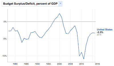
There's the revenue, and in terms of how big a piece of our pie it's around 20 percent, maybe less. I notice income tax - both personal and corporate - rise and fall relative to the state of the economy, while social security and the others (not shown here) have kept relatively steady. The peak revenue overall was 20% in 2000, which coincides with the peak budget surplus.

The point is, if I'm going to look at these issues and form opinions, let alone vote and try to convince others to vote with me, I better to do it with data. Whatever conclusions I ultimately reach, I'm going to know more with it than without it. That's probably the best I can do. Twitizen @abuaardvark once tweeted, "Sometimes I feel like the entire Internet is an exercise in documenting confirmation bias theory," or, as noted Wrongologist Kathryn Shulz points out, being wrong about something doesn't actually feel bad. It's only realizing you're wrong that feels bad.


Wednesday, April 13, 2011

Health Information System as Data Conduit

A health information exchange is a device that moves medical information from one authorized entity to another. Ultimately, these "authorized entities" are people who need to examine medical records, but an authorized entity may also refer to a device, for example a computer you use to manipulate and work with medical records. Anything that holds a copy for a period of time falls under this category and must therefore follow the rules. Secure transmission is essentially a solved problem, and may be treated in a separate data transmission layer. While consent and authorization rules may get complicated, at any given time an entity may or may not have authorization to view a piece of medical information. When you request protected health information (PHI) it is delivered from a repository to you, across a network. While you are working with the PHI, you keep a copy in your sphere of control. The data exists in its secure repositories, and in your immediate control, and nowhere in between.

Anywhere PHI may be stored and used must be secure. Yes, it's great to have all that important information zipping around everywhere, but first, do no harm.

This is a diagram of the basic information flow.


When you want to work with a patient's medical record, you request a copy from a repository (maybe more than one) and it is delivered from the repository to you without leaving a trace anywhere in between. No copies, no caching, nothing. When you're done, all that PHI disappears completely from you local system, leaving only those copies stored in secure repositories within the health care system.

A health care professional (provider) is authorized to view a particular piece of PHI for a period of time. When a device or person becomes "de-authorized" to view a record, for example when a provider "logs out," then that PHI should be gone, leaving nothing of itself anywhere in the system. If a patient changes providers, then the consent rules change accordingly. Most commonly, consent is given for a finite period of time and will expire unless explicitly renewed. (This medical record will self-destruct on July 13, 2011.) PHI always exists in the secure repository and the patient, that is to say the person whose medical record it is (the "owner" of that medical record), is permanently authorized to handle the PHI and give or take away consent.

An ideal medical record, therefore, knows who is and isn’t authorized to see it at any given time, and is kind enough to politely decline to be transmitted or remove itself from an unauthorized system.

Thursday, April 7, 2011

On Demand CCDs: Continuity of Care

At Axolotl, we dynamically generate template based CDA documents from various data sources.


One commonly transmitted document is the CCD, or Continuity of Care Document. This is a summary document, its intended purpose to have enough information, well organized, to preserve the continuity of patient care between different care providers.


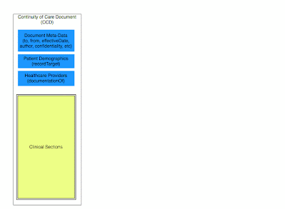
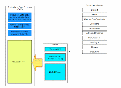
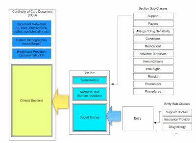
The way I approach template-based CDA is to first look at the document as a container for health data, and construct the empty container first.

You can see it has, first, the necessary meta-data. Source, destination, attribution, author, the time period this document covers, any confidentiality instructions, and other information about this document.


Then it has the patient demographics and a list of all healthcare providers involved in the care described, and all doctors who provided care during the covered period.


The largest part is the clinical information itself. This document is a container, and the clinical section is meant to contain a list of clinical sections.

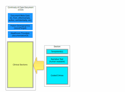
A section can be thought of as a smaller CDA entity in and of itself, and just as the document is composed of smaller pieces. It has template identifiers, a title, a human readable narrative text in an html-like format, and a number of entries. Each entry represents a single clinical event.

You can subclass the section into the different categories of clinical information, thereby putting a complete summary into a list of clinical sections.


The entries, themselves, have a wide variety of forms, so we subclass them into different types of entries for the various sections, support entries for the support section, insurance plan entries for the payers section, allergy entries for the alerts section, and so on.


If you need to build a CCD, or any template-based CDA document, that’s an approach to think about.

Saturday, February 26, 2011

1998: Best. Year. Ever.


The following story is true, if somewhat apocryphal.

In 1998, with a whirlwind of buzz and activity swirling around outside, my life was buried in programming. Day and night, all hours, building exciting new things that never existed before. To see the newfound power of the web used in real businesses, watching the web grow exponentially, making new connections, new discoveries, new inventions, it seemed to come by the hour. Hacking, hacking, hacking. My whole life I had a love of programming, and it felt like this was my moment. It was pure magic.

Which is not to say it was all work. Once in a while I might find a glass of wine next to my computer. Somebody must have put it there. I take a sip of wine and go back to work. Hack, hack, hack, it's all coming together, all the connections, the logical structure. Another sip of wine. Hack, hack the structure became a little less logical, recursion became loopy and I was getting tipsy. I stop. I look at the wine, I look at the computer, then I look up. It's 5pm on a Friday and the weekend has begun. I turn off the computer, pick up my glass of wine and step outside.

Our office was situated in one of those quaint downtown main streets that exist up and down the peninsula. We had a store front converted to hipster office space, and on a typical Friday after work, we could just move some chairs and tables outside for an impromptu cafe, with wine and cheese, talking about the future of the web, or maybe hearing an old war story from the ARPAnet days.

My neighbors, Bill and Christine, had a starship bridge in their home. We would gather to watch Star Trek on the view screen and maybe play around with Bill’s battlebot. Some evenings we would attend a meeting of the recently-formed Web Guild, and some nights, we would find out about a big dot-com launch party that everybody was crashing.

I don’t remember the company, and I’m not sure if I knew at the time. but It was a free party with a live band in a hip San Francisco nightclub and that’s all we needed to know. It wasn’t an open bar - none of that irresponsibly excessive burn rate wasting investors' money here! No, we each got two drink tickets at the door and the rest was cash bar. The band was playing, the place was thumping. Jello Biafra - of Dead Kennedys fame - jumped up on stage to join the band for a song. In his hand he had a large roll of those drink tickets, which he unspooled out into the crowd. I must have had a strip of tickets ten feet long, which I hung on my shoulders like a bandoleer. I walked up the the prettiest girl I saw and said, “Wow, the market hasn’t been this good since 1928! Can I buy you a drink?”

And that’s what it was really like in 1998. Or was it '99? Hard to tell, sometimes. Hard to tell.

Saturday, February 19, 2011

Visualizing Open Health Data with Fusion Tables


This post will describe a simple way to take health data, as curated in my last blog post, and visualize it using Fusion Tables (a Google Labs product).

A more sophisticated visiualization may be done with Fusion Tables and the Google Maps API, as detailed in the API Developer's Guide, Geo Section, but for this simple example we will create some maps by hand.

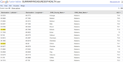
We start with the spreadsheet of CHSI data, by loading into Fusion Tables.


We then select the Visualize->Intensity Map option from the menu.

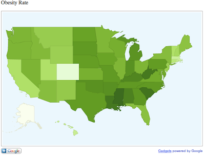
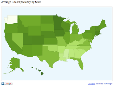
First, we are going to create heat maps of the various health status indicators. For example, average life expectancy, or ALE averaged by state produces a state-by-state map where states with the longer average life expectancy appears darker in color.

The way this works is fairly simple. Fusion Tables simply averages the county data by state and translates the result to a number. It scales the numbers by color, as we see below. In this example there is no data for Washington State so it appears completely white.
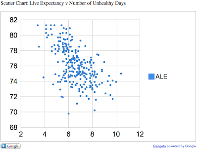
Next, we can create a scatter chart comparing two variables.
In this chart, we compare the average life expectancy on the Y-axis to the annual number of unhealthy days (by air quality) on the X-axis. As one might expect, areas of higher pollution have lower life expectancy.


This is just a quick and simple visualization of open data. Later we will go more in depth and refine our visualizations to extract useful and actionable information.

Thursday, February 10, 2011

Curating Open Health Data with Google Refine

In a previous post, I briefly discussed the meaning and implications of open, linked data. Today I will discuss some work I did at a recent Health 2.0 Hackathon with a particular data set.

The Tools

CHSI
I decided to start with the Community Health Status Indicators from HHS. I was familiar with this data set, having written a brief developer's guide for the first Health 2.0 Hackathon last fall. This is from HealthData.gov, part the government's ongoing "open government" initiative under President Obama and national CTO Aneesh Chopra.

Freebase
Freebase is an open semantic web database. This is the "linked data" part of our exercise. An explanation of what linked data is can be found at LinkedData.org and we won't deal with it in depth except to make connections between the open data released by HHS and real world data in the semantic web.

Google Refine
Google Refine (formerly GridWorks) is a tool for curating, reducing, and linking data using Freebase. Using Google Refine we can take an ordinary spreadsheet, correlate it with semantic data sets in Freebase, and create sets of triples for import into Freebase itself. For this exercise, I created a "base" ordomain of data in Freebase called CHSI. However, for the first session the challenge of translating tabular data into triples is one that could not be addressed in the time allotted.

The Process
The first step is to take a set of data in CSV format and import it into Google Refine as a new project.

This is easy enough and produces a spreadsheet in the familiar fashion.

Now, creating a spreadsheet is just the first step. The real magic happens when we link data in this spreadsheet to semantic data in Freebase. The act of linking data to the real world is called reification, and in Freebase this is done through the "reconcile" function. By clicking on the menu (arrow) icon on a column header, we see a number of menu options, one of which is "Start reconciling..."


The first thing to reconcile is the state. This is easy for Freebase to reason through, as state names are unique and easily recognized. After reconciling, we see each state name is now hyperlinked. We can follow the hyperlink to the Freebase entry for that state.

Next, we want to reconcile counties. The CHSI data is arranged by county, so we can get a fine-grained view of the nation's health data geographically. To reconcile county, we go through the same process.


In the next illustration, you see Freebase has recognized county name, and gives you the default of US County as the semantic data type for that column. If you just reconcile on the name, you'll get a hit-or-miss on the reification, so we want to give Freebase a little more information about this data element. In this case, we can include another column as an extra hint. For our additional column we select state name and start typing in the relationship "contained by." As you start typing, Freebase auto-completes the relationship.


After going through this process, we have hyperlinks in the state and county name columns. These link directly to Freebase and are now semantically linked to their respective entities. Now we can add more columns based on data in Freebase. If you go to the Freebase entry for a county, you will see a number of data elements listed such as GDP, population, pollution levels, household income, adjoining counties, geographical features (the "contained in" relationship") and many others. All of these can be added as additional columns in your spreadsheet.

In my next post, I will discuss visualizing this data.

For more information on using Google Refine, see Jeni's blog post Using Freebase Gridworks to Create Linked Data.


Open and Linked Data

I confess, I love buzzwords. I find them fascinating. Their implications their history, and what makes them buzzy in the first place. Two of my current favorites are what's known as "Open Data" and "Linked Data." Two fundamentally different concepts that work together.


Open Data

Open data means governments and other organizations are releasing data sets to the public domain, and making them accessible in various formats. The hope is that if we have enough open data, clever people will find new and useful applications for it. The old saw “Information wants to be free” applies here. Moreover, it is to everyone’s benefit that information be free. The more information we have, the better and more informed decisions we can make.

Linked Data

Linked data is in a literal sense the semantic web. Each data point is assigned a URI, and relationships between URIs are defined using semantic triples. For example, the County of Santa Clara in California may be represented with a URI:

http://www.freebase.com/view/en/santa_clara_county

The state of California:

http://www.freebase.com/view/en/california

And the country of USA:

http://www.freebase.com/view/en/united_states

A simple relationship “contained in” is then assigned: Santa Clara is containe

d in California. California is contained in USA. Therefore, Santa Clara is contained in USA. With this very simple set of relationships, we can list all the counties in a given state, or all the counties in the country. We can add other relationships, which we shall detail later.

Linked Data is an open platform. Relationships can be defined and queried without restriction.

Open Data and Government 2.0

When it comes to government data sets, the underlying principle is that this data belongs to the people, the citizens of each country. The broad hope is that if all the world’s governments make their public data available we can create semantic relationships and make new discoveries about how government and nations function, and develop better ideas of how they can be improved, removing inefficiencies, lowering costs, and improving effectiveness of public programs. It is possible, indeed likely, that we will find other unrelated uses for open data, for example in the area of making healthy decisions.

The UK is leading in these efforts, its program headed by Sir Tim Berners Lee. More information on the UK Open Data Project can be found here:

http://data.gov.uk/

In [date], the US Department of Health and Human Services (HHS) announced [summary], making a number of data sets public with plans to release more as they become available. In particular, Medicare and Medicaid cost and outcome data is put forward, as well as a number of metrics to measure the health status of communities.

HHS has partnered with Health 2.0 and other organizations to create the Health 2.0 Developer Challenge.

http://health2challenge.org

The implications of open and linked data are clear. If you are considering moving to another city, wouldn’t you want to know the quality of the air, water, education system, and health care? If you could compare these factors to other locations would you possibly make a better decision on where to live, work and raise a family? And shouldn’t we all have access to this information? The data is there. It is only left to us to turn that data into information, information into knowledge, knowledge into wisdom, and wisdom into a better way of life.


Open Data: The Role of Government in Fostering Smartphone Applications