Saturday, February 26, 2011

1998: Best. Year. Ever.


The following story is true, if somewhat apocryphal.

In 1998, with a whirlwind of buzz and activity swirling around outside, my life was buried in programming. Day and night, all hours, building exciting new things that never existed before. To see the newfound power of the web used in real businesses, watching the web grow exponentially, making new connections, new discoveries, new inventions, it seemed to come by the hour. Hacking, hacking, hacking. My whole life I had a love of programming, and it felt like this was my moment. It was pure magic.

Which is not to say it was all work. Once in a while I might find a glass of wine next to my computer. Somebody must have put it there. I take a sip of wine and go back to work. Hack, hack, hack, it's all coming together, all the connections, the logical structure. Another sip of wine. Hack, hack the structure became a little less logical, recursion became loopy and I was getting tipsy. I stop. I look at the wine, I look at the computer, then I look up. It's 5pm on a Friday and the weekend has begun. I turn off the computer, pick up my glass of wine and step outside.

Our office was situated in one of those quaint downtown main streets that exist up and down the peninsula. We had a store front converted to hipster office space, and on a typical Friday after work, we could just move some chairs and tables outside for an impromptu cafe, with wine and cheese, talking about the future of the web, or maybe hearing an old war story from the ARPAnet days.

My neighbors, Bill and Christine, had a starship bridge in their home. We would gather to watch Star Trek on the view screen and maybe play around with Bill’s battlebot. Some evenings we would attend a meeting of the recently-formed Web Guild, and some nights, we would find out about a big dot-com launch party that everybody was crashing.

I don’t remember the company, and I’m not sure if I knew at the time. but It was a free party with a live band in a hip San Francisco nightclub and that’s all we needed to know. It wasn’t an open bar - none of that irresponsibly excessive burn rate wasting investors' money here! No, we each got two drink tickets at the door and the rest was cash bar. The band was playing, the place was thumping. Jello Biafra - of Dead Kennedys fame - jumped up on stage to join the band for a song. In his hand he had a large roll of those drink tickets, which he unspooled out into the crowd. I must have had a strip of tickets ten feet long, which I hung on my shoulders like a bandoleer. I walked up the the prettiest girl I saw and said, “Wow, the market hasn’t been this good since 1928! Can I buy you a drink?”

And that’s what it was really like in 1998. Or was it '99? Hard to tell, sometimes. Hard to tell.
Saturday, February 19, 2011

Visualizing Open Health Data with Fusion Tables


This post will describe a simple way to take health data, as curated in my last blog post, and visualize it using Fusion Tables (a Google Labs product).

A more sophisticated visiualization may be done with Fusion Tables and the Google Maps API, as detailed in the API Developer's Guide, Geo Section, but for this simple example we will create some maps by hand.

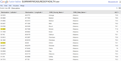
We start with the spreadsheet of CHSI data, by loading into Fusion Tables.


We then select the Visualize->Intensity Map option from the menu.

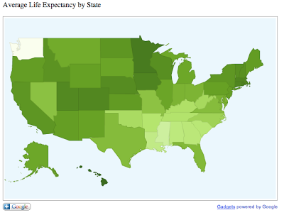
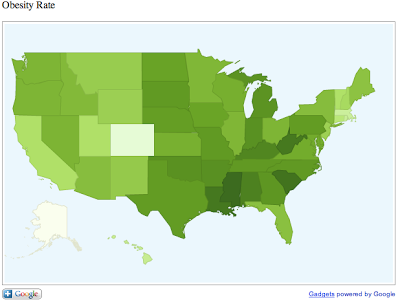
First, we are going to create heat maps of the various health status indicators. For example, average life expectancy, or ALE averaged by state produces a state-by-state map where states with the longer average life expectancy appears darker in color.

The way this works is fairly simple. Fusion Tables simply averages the county data by state and translates the result to a number. It scales the numbers by color, as we see below. In this example there is no data for Washington State so it appears completely white.
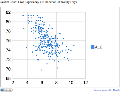
Next, we can create a scatter chart comparing two variables.
In this chart, we compare the average life expectancy on the Y-axis to the annual number of unhealthy days (by air quality) on the X-axis. As one might expect, areas of higher pollution have lower life expectancy.


This is just a quick and simple visualization of open data. Later we will go more in depth and refine our visualizations to extract useful and actionable information.

Thursday, February 10, 2011

Curating Open Health Data with Google Refine

In a previous post, I briefly discussed the meaning and implications of open, linked data. Today I will discuss some work I did at a recent Health 2.0 Hackathon with a particular data set.

The Tools

CHSI
I decided to start with the Community Health Status Indicators from HHS. I was familiar with this data set, having written a brief developer's guide for the first Health 2.0 Hackathon last fall. This is from HealthData.gov, part the government's ongoing "open government" initiative under President Obama and national CTO Aneesh Chopra.

Freebase
Freebase is an open semantic web database. This is the "linked data" part of our exercise. An explanation of what linked data is can be found at LinkedData.org and we won't deal with it in depth except to make connections between the open data released by HHS and real world data in the semantic web.

Google Refine
Google Refine (formerly GridWorks) is a tool for curating, reducing, and linking data using Freebase. Using Google Refine we can take an ordinary spreadsheet, correlate it with semantic data sets in Freebase, and create sets of triples for import into Freebase itself. For this exercise, I created a "base" ordomain of data in Freebase called CHSI. However, for the first session the challenge of translating tabular data into triples is one that could not be addressed in the time allotted.

The Process
The first step is to take a set of data in CSV format and import it into Google Refine as a new project.

This is easy enough and produces a spreadsheet in the familiar fashion.

Now, creating a spreadsheet is just the first step. The real magic happens when we link data in this spreadsheet to semantic data in Freebase. The act of linking data to the real world is called reification, and in Freebase this is done through the "reconcile" function. By clicking on the menu (arrow) icon on a column header, we see a number of menu options, one of which is "Start reconciling..."


The first thing to reconcile is the state. This is easy for Freebase to reason through, as state names are unique and easily recognized. After reconciling, we see each state name is now hyperlinked. We can follow the hyperlink to the Freebase entry for that state.

Next, we want to reconcile counties. The CHSI data is arranged by county, so we can get a fine-grained view of the nation's health data geographically. To reconcile county, we go through the same process.


In the next illustration, you see Freebase has recognized county name, and gives you the default of US County as the semantic data type for that column. If you just reconcile on the name, you'll get a hit-or-miss on the reification, so we want to give Freebase a little more information about this data element. In this case, we can include another column as an extra hint. For our additional column we select state name and start typing in the relationship "contained by." As you start typing, Freebase auto-completes the relationship.


After going through this process, we have hyperlinks in the state and county name columns. These link directly to Freebase and are now semantically linked to their respective entities. Now we can add more columns based on data in Freebase. If you go to the Freebase entry for a county, you will see a number of data elements listed such as GDP, population, pollution levels, household income, adjoining counties, geographical features (the "contained in" relationship") and many others. All of these can be added as additional columns in your spreadsheet.

In my next post, I will discuss visualizing this data.

For more information on using Google Refine, see Jeni's blog post Using Freebase Gridworks to Create Linked Data.


Open and Linked Data

I confess, I love buzzwords. I find them fascinating. Their implications their history, and what makes them buzzy in the first place. Two of my current favorites are what's known as "Open Data" and "Linked Data." Two fundamentally different concepts that work together.


Open Data

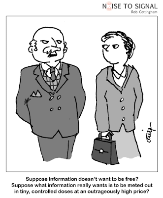
Open data means governments and other organizations are releasing data sets to the public domain, and making them accessible in various formats. The hope is that if we have enough open data, clever people will find new and useful applications for it. The old saw “Information wants to be free” applies here. Moreover, it is to everyone’s benefit that information be free. The more information we have, the better and more informed decisions we can make.

Linked Data

Linked data is in a literal sense the semantic web. Each data point is assigned a URI, and relationships between URIs are defined using semantic triples. For example, the County of Santa Clara in California may be represented with a URI:

http://www.freebase.com/view/en/santa_clara_county

The state of California:

http://www.freebase.com/view/en/california

And the country of USA:

http://www.freebase.com/view/en/united_states

A simple relationship “contained in” is then assigned: Santa Clara is containe

d in California. California is contained in USA. Therefore, Santa Clara is contained in USA. With this very simple set of relationships, we can list all the counties in a given state, or all the counties in the country. We can add other relationships, which we shall detail later.

Linked Data is an open platform. Relationships can be defined and queried without restriction.

Open Data and Government 2.0

When it comes to government data sets, the underlying principle is that this data belongs to the people, the citizens of each country. The broad hope is that if all the world’s governments make their public data available we can create semantic relationships and make new discoveries about how government and nations function, and develop better ideas of how they can be improved, removing inefficiencies, lowering costs, and improving effectiveness of public programs. It is possible, indeed likely, that we will find other unrelated uses for open data, for example in the area of making healthy decisions.

The UK is leading in these efforts, its program headed by Sir Tim Berners Lee. More information on the UK Open Data Project can be found here:

http://data.gov.uk/

In [date], the US Department of Health and Human Services (HHS) announced [summary], making a number of data sets public with plans to release more as they become available. In particular, Medicare and Medicaid cost and outcome data is put forward, as well as a number of metrics to measure the health status of communities.

HHS has partnered with Health 2.0 and other organizations to create the Health 2.0 Developer Challenge.

http://health2challenge.org

The implications of open and linked data are clear. If you are considering moving to another city, wouldn’t you want to know the quality of the air, water, education system, and health care? If you could compare these factors to other locations would you possibly make a better decision on where to live, work and raise a family? And shouldn’t we all have access to this information? The data is there. It is only left to us to turn that data into information, information into knowledge, knowledge into wisdom, and wisdom into a better way of life.


Open Data: The Role of Government in Fostering Smartphone Applications